Here are some useful scripts that I have been using.
=======================Plot multiple lines=========
The data file "sample-gyro.txt" has the following structure:
Times Xaxes Yaxes Zaxes
307 -0.19718285 0.023448335 -0.07674138
504 -1.067982 0.0031973913 -0.2600678
706 0.9443428 0.19611599 0.11511141
905 -0.47430366 0.08313616 -0.17906323
1105 -0.7034612 -0.075675584 -0.2696605
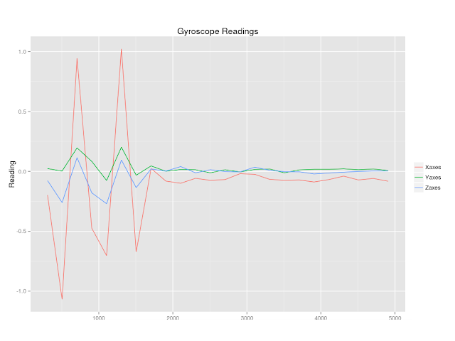
I would like to plot gyroscope sensor reading from three dimensions in one graph.

library(ggplot2)
library(reshape)
df = read.table("gyro.txt")
names(df) = c("Times","Xaxes","Yaxes","Zaxes")
df_long = melt (df,id="Times")
ggplot(df_long,aes(x=df_long$Times,y=df_long$value, colour=df_long$variable))+geom_line()+xlab("Time") + ylab("Reading")+ scale_colour_discrete(name = "") + ggtitle("Gyroscope Readings")
=======================Smooth==================[1]
This is what I like about R. You can easily process your data. Here is an example of smoothing an accelerometer sensor reading from z axes using (loess)local polynomrial regression fitting. The blue dots are original data points, and the black curve represents the smoothed data.
library(ggplot2)
df = read.table("sample-accel.txt")
names(df) = c("times","data")
x = df$times
y = df$data
y.loess = loess(y~x, span=0.75,data.frame(x=x,y=y))
y.predict = predict(y.loess,data.frame(x=x))
ggplot()+geom_point(data=df,aes(x=seq(1,length(x)),y=df$data),color="dodgerblue",size=2,alpha=0.5)+geom_line(data=df,aes(x=seq(1,length(x)),y=y.predict),color="black")+xlab("Time(ms)")+ylab("Reading(m/s^2)")+ggtitle("Accel. Z-axes Reading (Smoothed)")
You can save your figure in several formats such as png and pdf.
ggsave(filename="figure1.png")You can save the smoothed data into a csv file for future use.
c=paste(x,y.predict,sep=",")
write(c,file="file.csv")
[1]http://blog.revolutionanalytics.com/2010/03/smoothing-time-series-with-r.html

No comments:
Post a Comment